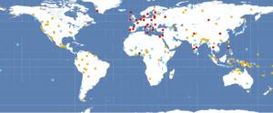
I used to plot my typological language data to geo-spatial maps with Generic Mapping Tools, which is awesome, and where a simple two-liner will do the job. But I found this hard to use in teaching, since it doesn’t run smoothly on everyone’s operating system. So it’s time for me to move on and learn to do maps with R. There are a few awesome resources out there, including lingtypology, which reads data directly off glottolog.
But I wanted to plot data that is not included in a database, and since it’s actually easy, but not entirely trivial to find on the internet so far, here’s a short tutorial. First of all, here is our little data set, with geo-spatial coordinates for each language, language family and basic word order info. Save this to a text file in your working directory with the name “typology.txt”.
Language,Latitude,Longitude,Family,Family2,Word order
Movima,-13.81,-65.63,Isolate,9,0
Arapaho,43.39,-108.81,Algic,10,OV
Alta,15.69,121.45,Austronesian,12,OV
Savosavo,-9.13,159.81,Isolate,9,OV
Teop,-5.67,154.97,Austronesian,11,VO
Sumi,26,94.42,Sino-Tibetan,12,VO
Yali,-4.08,139.46,Nuclear-Trans-New-Guinea,13,OV
Beja,17.24,36.67,Afro-Asiatic,14,VO
Vera'a,-13.89,167.43,Austronesian,11,OV
Cabecar,9.67,-83.41,Chibchan,15,VO
Urum,42.04,43.99,Turkic,16,OV
Dolgan,71.11,94.29,Turkic,16,OV
Gorwaa,-4.24,35.8,Afro-Asiatic,14,OV
Pnar,24.82,92.26,Austroasiatic,17,0
Goemai,8.74,9.72,Afro-Asiatic,14,VO
English,53,-1,Indo-European,7,VO
Nung,-29.71,19.08,Tuu,18,VO
Bora,-2,-72.26,Boran,19,VSO
Nafsan,-17.7,168.38,Austronesian,11,OV
Komnzo,-8.65,141.52,Yam,20,OV
Kamas,55.07,94.83,Uralic,21,VO
Kakabe,10.6,-11.44,Mande,22,OV
Daakaka,-16.27,168.01,Austronesian,11,VO
Next in your R script, load the following packages. You might have to install them first:
library(ggplot2)
library(maps)
library(sf) #for advanced mapping options
library(viridisLite) #for pretty, color-blind friendly color palettes
Read in your map data and your language coordinates and save them to short variables like “map” and “df” (for data frame).
df <- read.csv("typology.txt")
head(df) #shows you the beginning of the data, good for trouble shooting
map <- map_data("world")
In order to plot your language coordinates with additional information about language families, do this:
#family
ggplot() +
  geom_polygon(data = map, aes(x = long, y = lat, group=group), fill="#dddddd") + #plots the world map in the background in light grey
  geom_point(data = df, aes(x = Longitude, y = Latitude, fill = factor(Family)), shape=21, size=3) + #plots the language coordinates
  theme_minimal()+ #fewer embellishments
  coord_sf()+ #nice proportions
  scale_fill_viridis_d(option = "plasma")+ #color scheme
  labs(fill = "Family", y="",x="") #labels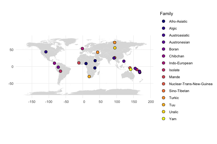
To get information about word order patterns, instead use this:
#word order
ggplot() +
  geom_polygon(data = map, aes(x = long, y = lat, group = group), fill="#dddddd") +
  geom_point(data = df, aes(x = Longitude, y = Latitude, fill = factor(Word.order)), shape=21,  size=3) +
  theme_minimal()+
  coord_sf()+
  scale_fill_viridis_d(option = "plasma")+
  labs(fill = "Word Order", y="",x="")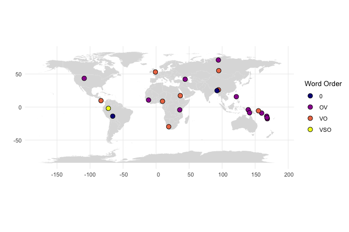
And since newbies sometimes use my tutorials: If you don’t understand something here, don’t give up, google it! Everyone does it, and most questions you might have, have already been asked and answered by someone somewhere.