I made a tutorial on how to plot typological data (here from grambank) with R.
Here is the code.
library(ggplot2) # for creating nice plots
library(dplyr) # for manipulating data frames
library(sf) # for manipulation of shape files
library(rnaturalearth) # for geographic data
library(rnaturalearthhires) # for high resolution geographic data
library(lingtypology) # for access to databases such as glottolog
library(viridis) # for colorblind-friendly color palettes


# Download to a temporary file
grambank057 <- tempfile(fileext = ".geojson")
download.file(
  "https://grambank.clld.org/parameters/GB057.geojson",
  grambank057
)


# Read the downloaded geoJson file with the sf library:
grambank  <- read_sf(grambank057)
head(grambank)

# create base map of Cameroon
cameroon <- ne_states(country = "Cameroon", returnclass = "sf")

# filter out all data points from grambank that are not in Cameroon
camerbank <- st_filter(grambank, cameroon)
head(camerbank)


#Grambank
ggplot() +
  geom_sf(data=cameroon)+
  theme_void() +
  geom_sf(data = camerbank, aes(fill=label), pch=21, size=2)+
  scale_fill_viridis(option="inferno", discrete=TRUE)
I regularly go a little overboard when designing puzzles for the German Olympiad of Linguistics, but for one of this year’s puzzles, I really outnerded myself. I designed a True Type Font for the writing system Afaka, which was developed for the creole language Ndyuka. It was conceived in 1910 by Afáka Atumisi and is named after its inventor. It’s a syllabary, partially based on a rebus system.
For example, the symbol representing the syllable /fo/ shows four vertical lines. And there is an Afaka word pronounced “fo”, which means “four” (yes, it’s cognate with the English word).
There is a preliminary Unicode sheet with codes, but the writing system hasn’t been fully developed and codified so far. Accordingly, my font is also only a preliminary solution to writing Ndyuka in Afaka script. But it’s great for playing around, and designing puzzles! You can download the font here.
I used to plot my typological language data to geo-spatial maps with Generic Mapping Tools, which is awesome, and where a simple two-liner will do the job. But I found this hard to use in teaching, since it doesn’t run smoothly on everyone’s operating system. So it’s time for me to move on and learn to do maps with R. There are a few awesome resources out there, including lingtypology, which reads data directly off glottolog.
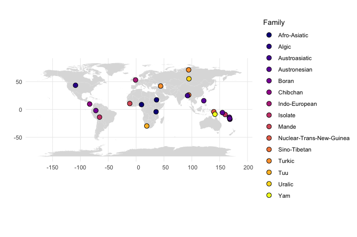
But I wanted to plot data that is not included in a database, and since it’s actually easy, but not entirely trivial to find on the internet so far, here’s a short tutorial. First of all, here is our little data set, with geo-spatial coordinates for each language, language family and basic word order info. Save this to a text file in your working directory with the name “typology.txt”.
Read in your map data and your language coordinates and save them to short variables like “map” and “df” (for data frame).
df <- read.csv("typology.txt")
head(df) #shows you the beginning of the data, good for trouble shooting
map <- map_data("world")
In order to plot your language coordinates with additional information about language families, do this:
#family
ggplot() +
  geom_polygon(data = map, aes(x = long, y = lat, group=group), fill="#dddddd") + #plots the world map in the background in light grey
  geom_point(data = df, aes(x = Longitude, y = Latitude, fill = factor(Family)), shape=21, size=3) + #plots the language coordinates
  theme_minimal()+ #fewer embellishments
  coord_sf()+ #nice proportions
  scale_fill_viridis_d(option = "plasma")+ #color scheme
  labs(fill = "Family", y="",x="") #labels
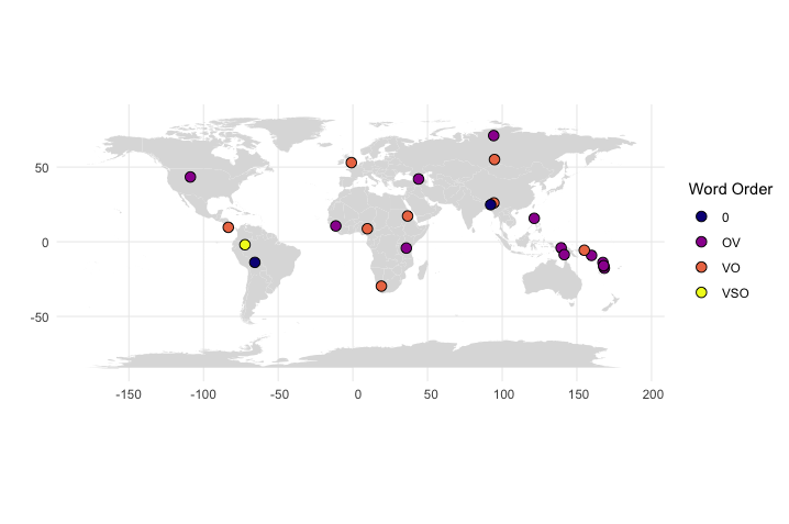
To get information about word order patterns, instead use this:
#word order
ggplot() +
  geom_polygon(data = map, aes(x = long, y = lat, group = group), fill="#dddddd") +
  geom_point(data = df, aes(x = Longitude, y = Latitude, fill = factor(Word.order)), shape=21,  size=3) +
  theme_minimal()+
  coord_sf()+
  scale_fill_viridis_d(option = "plasma")+
  labs(fill = "Word Order", y="",x="")
And since newbies sometimes use my tutorials: If you don’t understand something here, don’t give up, google it! Everyone does it, and most questions you might have, have already been asked and answered by someone somewhere.
Once you have submitted your article to a research journal, it can take a few weeks to a few months before you hear back. During that time, your editors are busy finding competent and willing reviewers, and hopefully, those reviewers are busy reading your work with discretion and charity and thinking about the best ways to help you improve your manuscript. If you do not hear back from the editors after 3 months, feel free to send them a friendly reminder that you are still waiting for reviews.
This is a very specific problem with Generic Mapping Tools which I didn’t find well documented: if you map certain symbols to a list of coordinates specified in COORDINATES.xy, you can specify that subsets of those coordinates are mapped to symbols in different colors in two ways:
[download id=”327″] Here is the pdf that I used to produce the storyboard picture books now available at amazon. I have used storyboards both from the Totem Field Storyboards site and storyboards I have produced as part of the MelaTAMP research project. The Daakaka text is a selection of the results from last year’s fieldwork on Ambrym. Enjoy!
This is a very specialised problem, but since I just found the solution, I wanted to briefly document this for myself. I usually use natbib, but for the preparation of reading lists, sorted by topic, I wanted to try biblatex. Creating a list of references selected by a keyword is not a problem at all.
When your manuscript has been accepted for publication, and you have adjusted the layout to the publisher’s requirements, these are the final steps before submission:
If you have many interlinearized examples in your LaTeX documents, you have probably wondered about the best way to handle them. Here are some ideas. There are two potential problems with the glosses: 1) different publishers may have different requirements for how to print them, so transferring glossed examples from one manuscript to another may be difficult. 2) You’ll want to have a list of all the glosses in your document, and it should be complete and consistent. To solve all that, the main strategy is to label all your glosses explicitly as such by using a new command we may call “Gloss”: